The Android logo, in my opinion, deserves to go down in history as one of the greatest ever. I have never seen any other brand draw as much positivity as the little green robot does for the platform, and has certainly played it’s role in helping the operating system grow to the point it has so far. Yet, until when I read this post on the New York Times, I realized I never really tried to find out who designed the logo and how did it come about.
There is one key passage from the post that I wanted to highlight here, regarding the inspiration and the vision that the team at Google had for the logo:
The logo, she (Irina Blok, who created the logo) was told, should involve a robot, and so she studied sci-fi toys and space movies — anything that might help her create a character. In the end, she took inspiration from a distinctly human source: the pictograms of the universal man and woman that often appear on restroom doors. She drew a stripped-down robot with a tin-can-shaped torso and antennas on his head.
While Blok worked on her design, she and her colleagues agreed that the logo, like the software, should be open-sourced. "We decided it would be a collaborative logo that everybody in the world could customize," she says. "That was pretty daring." Most companies, of course, defend their trademark from copycats, and million-dollar lawsuits have been filed over the rights to corporate insignia. This one would remain free.
 The first paragraph made me think of the popular T-shirt to the right, one that I am now quite proud to own. That T-shirt now almost feels like a part of the history of Android.
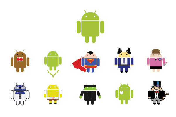
However, it is the second paragraph that really strikes a chord: one of the major reasons regarding the positivity to the Android logo is the fact that we have seen it take innumerable forms over the past six years. We have seen Irina’s creation as pins that attendees at MWC would run around to collect, as portable speakers, collectible figurines and also our very own Phandroid max
Allowing people such freedom has helped create a better community for fans. It has also added a sense of fluidity to the brand that nobody else can match.
If you would like to learn more about the history of the Android logo, I’d recommend reading this, this and this.

No comments:
Post a Comment